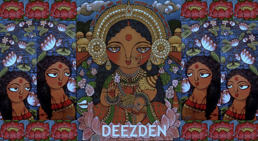
Welcome to Deezden! My name is Dithi and am a self-taught artist, now living in Geneva (Switzerland). I love to drink 'masala' chai! Indian traditions, women, mythology and folklore inspire my paintings. This blog is about my art, my life and my likes (not so much dislikes).
Feel free to leave me a comment after my posts. For any questions, commission inquiries, purchases through Etsy etc. email me at happydithi@gmail.com
Meanwhile at home ... ;)
-
There is always new and exciting things happening at the store ... but
since the focus of all our shoots has moved from my home to other locations
... ...
Connecting with Mother Nature | My Summer Garden.
-
Today seems like a perfect day to start writing about our summer garden
that lays buried under a two-feet thick mattress of snow and ice.
In Minnesota,...
September!
-
[image: Sept 2018 desktop calendar]
Time to change your desktop calendar.
Better late than never!
And it's my birthday tomorrow so I couldn't not post my mo...
Art&Light Crockery, PostCard Series
-
In these days of instant communication with whatsapp, skype, google duo
and many such similar technologies that make our lives so much easier,
we've all b...
Hello!
-
Is it me you are looking for? When I was invited by Isprava to view their
lovely villas in Goa Sorry for being AWOL for the last few weeks. I have a
very g...
Heartbeat of the Mother
-
No começo da minha caminhada no mundo espiritual, há alguns anos atrás,
mergulhei fundo nos ensinamentos do mundo Xamânico guiada por uma amiga
muito q...
Interiors: Bed & Chai Guest House, Delhi
-
[image: patchwork kantha bench]
Coraline is French and has lived in Delhi for 6 years. She runs Bed & Chai
in South Delhi, which she opened 3 years ago with...
There is a kind of hush...
-
Woke up to the kind of hush that I have come to recognise.
I was glad I hadn't stored the snow boots away.
It is spring but today snow has been breathtakin...
Sri Lankan Chronicles Collection
-
These are Illustrations for Sri Lankan Chronicles Collections Of Stories
written by Children for Client: Aparna Raman, Founder, Timbuktoo, ...
Guest Post > for Krya
-
Preethi Sukumaran, founder of one of my favourite brands – Krya, asked if I
would write a guest post for her blog on why I love handloom fabric.
Preethi, t...
NEW location!
-
MASALA CHAI has moved.
Please update your bookmarks! and follow me for fresh #desihip art+design at
*www.masalachai.in*
*www.masalachai.in*
Coming soon..
-
*I *have been gone through April. Traveling and picking up lost threads of
work family and friends. That done, a few things are in store for the blog.
Sta...
Pasta with pork chops
-
*Ingredients:*
(4-5 servings)
- 400 grams of pasta
- 4 pork chops
- 1 green pepper
- 1 onion
- 1 tomato
- 100 cc of white wine
- 400 grams of canned...
Bedroom Design Ideas For Men
-
Gentlemen, when you decide to decorate your bedroom surely you want to have
a stylish and functional design that also shows your masculine side. Well,
read...
Hunting @ Bhimbethka, Bhopal
-
Hunting @ Bhimbethka, Bhopal, originally uploaded by Prashant ॐ Bhardwaj.
This is probably a scene from a hunting scene during the middle stone age.
Notic...
Difficile dare qualche giudizio o consiglio per la tua "Ri-strutturazione". Allo stato attuale è già tutto così bello... Complimenti per la tua Arte, i tuoi colori, i tuoi lavori sono stupendi! é un davvero un piacere averti incontrata... (P.s.:Grazie per aver introdotto l'opzione "Traduzioni"). Un caro saluto Miriam
Aditi, Magdalena, Sonia: mmm, would you still say that with the white background? I mean does it look slightly lighter now?
Louis: :)
Theresa: Thank you for the unconditional support, means a lot you guys.
Arch: that is a relief to finally know that may be this can work.
Anyway, do drop in if you can again as I may be adding the final details over the next few days. Only when I am done with my re-formating will I post, I have just SO MUCH waiting to be posted, photographs from the art fair and book fair that just got over in Geneva.
The two main things about the 3-column layout that I'm not very fond of is that there is so little space between the columns (feels crowded), and the uneven alignment of the content horizontally (looks a bit messy).
I personally believe more space between the columns would allow the page to breathe more easily... more air - more energy, it's as simple as that :)
Also, I agree with Fernanda. I absolutely loved the warm red colour, and I think it made your site stand out even more. White is fine too, but has a totally different energy. Not better or worse, just different!
However, it's all about art and freely expressing oneself - isn't it? You are the artist here, so go with what you feel for! I'll definitely be coming back for more, enjoying it just as much regardless of colours, columns etc..! :)
Hola! tustrabajos son excelente, me ecnanto el color y me gusta mucho tu cultura o lo que conozco de ella. El trabajo de los loritos es excelente. Pasate si queres por mi blog y te invito a que te pongas como seguidora, un abrazo
Magdalena: First of all, thank you for participating in this 'coz the feedback helped me get clarity of thought about what looks better. I agree with you about the warmth of that textured red background and I think the present template manages to retain that to some extent.
At times, the red was over-powering and the photographs that I posted struggled (exaggerating here) to be seen.
What I have done now helps separate the three columns distinctly yet helps me continue with a warm Indian colour palette.
Florsazuladas: Gracias
Marguaritte: :)!
Miriam: la ristrutturazione è buona per ora, grazie, sperano che abbiate avuto un grande fine settimana anche!
Chandan: I like it too, finally have reached at a decision about how I want deezden to look. Will let this template stay for a while now.
THANK YOU all you guys for the constant feedback. Really helped. Am back to painting again. BIG KISS.
Dee, 3 column is neat but the middle column feels squeezed :) As for the color, although red is one of my fav colors, it was a bit dark particularly making it hard to read the purple writing on red...my two cents :)


18 comments:
Hey SWEET friend! Did you know~ There are no shortcuts to anyplace WORTH going?~ (yes! you DO know that!)
Love you sweet pea!
LOVE.love.LOVE.
e
Difficile dare qualche giudizio o consiglio per la tua "Ri-strutturazione". Allo stato attuale è già tutto così bello...
Complimenti per la tua Arte, i tuoi colori, i tuoi lavori sono stupendi! é un davvero un piacere averti incontrata...
(P.s.:Grazie per aver introdotto l'opzione "Traduzioni").
Un caro saluto
Miriam
I liked the 2 columns version.
I like(d) the 2 column version much better.
I see some difficult about sliders and youtube. Your words and your works are the gem of this blog.
I could read you even in six columns. bye.
Your art and blog are beautiful.
You are an inspiration whether it be 2 or 3 columns :)
Theresa
I like the 3 column. The white background is a perfect canvas for your colourful paintings.
Looks more organized & structured, since you have loads happening on your page:-)
Thumbs up for this layout!
Arch
Miriam: Thank you, BIG HUG!
Aditi, Magdalena, Sonia: mmm, would you still say that with the white background? I mean does it look slightly lighter now?
Louis: :)
Theresa: Thank you for the unconditional support, means a lot you guys.
Arch: that is a relief to finally know that may be this can work.
Anyway, do drop in if you can again as I may be adding the final details over the next few days. Only when I am done with my re-formating will I post, I have just SO MUCH waiting to be posted, photographs from the art fair and book fair that just got over in Geneva.
More soon.
I miss your FABULOUS RED background!!
Dithi,
The two main things about the 3-column layout that I'm not very fond of is that there is so little space between the columns (feels crowded), and the uneven alignment of the content horizontally (looks a bit messy).
I personally believe more space between the columns would allow the page to breathe more easily... more air - more energy, it's as simple as that :)
Also, I agree with Fernanda. I absolutely loved the warm red colour, and I think it made your site stand out even more. White is fine too, but has a totally different energy. Not better or worse, just different!
However, it's all about art and freely expressing oneself - isn't it? You are the artist here, so go with what you feel for! I'll definitely be coming back for more, enjoying it just as much regardless of colours, columns etc..! :)
Thanks for being absolutely fantastic, Dithi!
Hola! tustrabajos son excelente, me ecnanto el color y me gusta mucho tu cultura o lo que conozco de ella. El trabajo de los loritos es excelente. Pasate si queres por mi blog y te invito a que te pongas como seguidora, un abrazo
Yes, this re-structure definately looks clearer to me. Me likey...
Come va la tua Ri-strutturazione?
Un grande abbraccio e buona giornata!
Miriam
Hi Dee!!
Love the new look of the den. Esp the blog header it is awesome.!
C
Fernanda: I know, I was missing it too initially.
Magdalena: First of all, thank you for participating in this 'coz the feedback helped me get clarity of thought about what looks better. I agree with you about the warmth of that textured red background and I think the present template manages to retain that to some extent.
At times, the red was over-powering and the photographs that I posted struggled (exaggerating here) to be seen.
What I have done now helps separate the three columns distinctly yet helps me continue with a warm Indian colour palette.
Florsazuladas: Gracias
Marguaritte: :)!
Miriam: la ristrutturazione è buona per ora, grazie, sperano che abbiate avuto un grande fine settimana anche!
Chandan: I like it too, finally have reached at a decision about how I want deezden to look. Will let this template stay for a while now.
THANK YOU all you guys for the constant feedback. Really helped. Am back to painting again. BIG KISS.
Hey Dithi, this looks great! Well done :)
Dee, 3 column is neat but the middle column feels squeezed :) As for the color, although red is one of my fav colors, it was a bit dark particularly making it hard to read the purple writing on red...my two cents :)
Your blogs looks great, can see so much more of your written and painted art! Brilliant!
Post a Comment